
What are color profiles? And why do they matter?
Learn the difference between sRGB and Display P3 — and which one to choose
Ever glanced over at someone else’s computer screen and thought their colors looked more or less vibrant than yours? Even when you both had the same file open and the brightness on full? Chances are, your displays were using different color profiles.
If you’re not sure what that means, you’re in the right place! We’re about to walk you through what color profiles are and why they matter for designers. We’ll also take a look at two common color profiles — sRGB and Display P3 — so you can design with even more confidence.
Let’s get to it.
What are color profiles?
Assigning hex codes is one way to choose what colors you want in your design. But that’s not enough to control what colors appear on your screen. That’s because not every screen displays colors in the same way. Each screen has a unique minimum and maximum level of vibrancy. Take the color, teal, for example. While there’s only one hex code for teal (#008080), it’ll appear more intense or more washed out depending on the display.
Color profiles help standardize what your colors look like across different screens. In the world of design, there are two types of color profiles you’ll run into most often: sRGB and Display P3. Let’s take a closer look at their differences.
sRGB
sRGB has been around since the mid-90s. As its name suggests, it’s based on the RGB color model, which uses red, green and blue to produce all kinds of colors. Today, it’s hard not to come across a smartphone, TV, tablet, or desktop that doesn’t support sRGB.
Display P3
In 2015, Apple created Display P3 — a new color profile introduced with the first iMac to feature a Retina Display. Since then, there have been many more devices to come out with Wide Gamut displays — also known as displays that support Display P3.
Though it’s also based on the RGB color model, Display P3 offers a much wider spectrum than sRGB — a quarter more to be exact. That means colors can appear much more vibrantly in a Display P3 space. It also means that, when you choose a color within Display P3, but then render it within an sRGB space, it’ll look a little faded.

We can tell from the representation above that Display P3 has a wider spectrum of colors than sRGB.
Should I choose sRGB or Display P3?
Choosing the right color profile depends on what you’re designing — and who you’re designing for.
For example, virtually all displays today support sRGB. That means you won’t have to worry about your colors looking dull on someone else’s screen, making sRGB a safe choice when designing for a wide range of devices. sRGB is also the default color profile for web design. So, if you were typing your hex codes in CSS, you can be sure they’ll display in sRGB.
But if you’re creating apps that display lots of photos and videos, or designing for newer devices that use Wide Gamut displays — like the latest Macs and iPhones — you’ll be better equipped with a design tool that supports Display P3. That way, you can be sure that the colors you choose will appear exactly as they should on users’ screens — no guesswork needed. Our Mac app, for example, lets you switch between sRGB and Display P3 color profiles, enabling you to design for a much wider audience.
How to apply color profiles in Sketch
In addition to sRGB, Sketch also supports Display P3, which enables you to design for users with Wide Gamut displays, such as newer Mac and iPhone devices.
There are two ways to apply color profiles in the Mac app — each with its own benefits.
If you’d like to apply a color profile to all new documents from now on, head to Sketch > Preferences > Canvas. Then, click on the Color Profile drop-down menu and choose between Display P3 and sRGB.
If you’re only looking to apply a color profile to your current document, head to File > Document Settings… > Canvas. Then choose a color profile from the drop-down menu.
As soon as you’ve applied a new color profile, you’ll see a pop-up message at the bottom of your Canvas letting you know you’ve applied it to your document. That also means you can have multiple documents open with different color profiles. And if you change color profiles halfway through designing, you’ll have the option to either convert your colors or assign new values.
Not sure which to pick? Think of it this way. If you want to preserve your colors’ appearance — regardless of their hex codes — choose Convert. If you deliberately chose your hex codes to match other design assets, choose Assign.
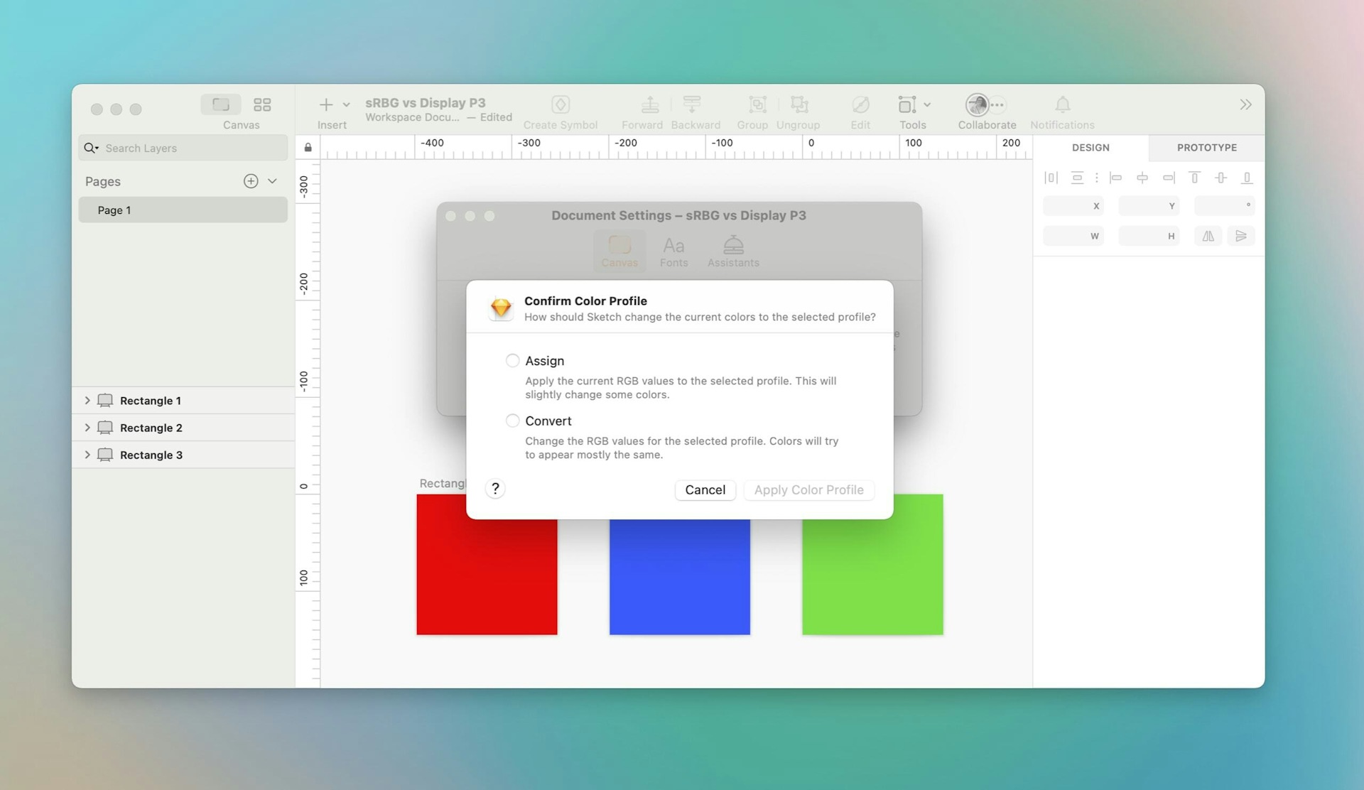
If you change color profiles halfway through designing, you’ll have the option to either convert your colors or assign new values.
Now that you know what color profiles are, it’s time to try them out! See the difference between sRGB and Display P3 for yourself with a free trial of Sketch. You might not be able to unsee it. 👀


