# Components
> Learn how to create and edit components in Sketch with the help of our step-by-step guides and video tutorials.
**URL:** https://www.sketch.com/docs/components-and-styles/components/ | **Last updated:** 2026-11-17
---
Components give you a way to save and reuse common elements across your designs. When you make changes to a component, those changes appear everywhere you use it. You can create different versions of a component and swap between them with [variants](/docs/components-and-styles/variants/) and use [overrides](/docs/components-and-styles/overrides/#how-to-apply-overrides) to change parts of individual component instances.
> **Note:** Before [Ghent (2026.4)](/changelog/ghent/), components were called Symbols. This naming change does not affect shortcuts or functionality (except for variants, which were also introduced in this release).
## Creating a component
To create a component, select a layer, frame, graphic, group, or multiple layers and choose **Create** in the toolbar, choose **Layer** > **Component** > **Create Component…** in the menu bar, or press ⌘Y.
In the Create Component sheet, give your component a name. You can also create or choose a **Group** for it, and decide which **Page** its source goes on: the current page, another page in your document, or a “Components” page (which Sketch creates if it doesn’t already exist). Sketch remembers your page choice for each document. If you’re turning a top-level frame into a component, the **Page** option doesn’t appear.
> **Note:** If you’ve already selected a component source, ⌘Y becomes **Add Variant** and adds a variant to it instead. If you’ve selected several component sources, it combines them as variants. Find out more in [Variants](/docs/components-and-styles/variants/#creating-variants).
### Component sources and instances
When you create a component, we create both a _source_ and an _instance_ of it. You can create as many instances of the same component as you like, but you’ll only ever have one source. If you make a change to a source, it also shows in every instance of that component in your document.
If you keep a component source on the current page, it has a purple highlight and name to make it clear it’s a component source.
### Turning a component back into layers
To turn a component back into regular layers, select its source in the layer list and choose **Layer** > **Component** > **Detach**, or press ⇧⌘Y. The source and its instances go back to the type of container they were before you made the component, such as a frame, a graphic, or a stack, and editing the source no longer changes them.
### Replacing a layer with a component
To replace any regular layer with a component, Control-click it and choose **Replace with Component…**, head to **Layer** > **Replace with Component…** in the menu bar, or search for _Replace with Component_ in the [command bar](/docs/interface-and-settings/the-mac-app-interface/the-command-bar/). Choose a component from the list and the instance resizes to fit the layer’s bounds.
## Creating nested components
Nested components give you finer control over complex designs. For example, a nested component can take the place of a design element, such as a logo, within a larger component like a banner. This way, any edits you make to your logo automatically show in your banner’s component source.
To create a nested component, insert a component instance inside another component source. When you edit that instance’s source, it updates everywhere, including inside the parent component.
There’s no limit to how many components you can nest within a component source. However, you can’t use a component instance inside its own source.
> **Note:** If you’ve selected a nested component, or a layer inside another component, you can select the parent component using **Edit** > **Select** > **Select Containing Component** (⇧⎋).
### Using nested component overrides
For even greater customization, you can create other versions of your nested component to use as overrides. For example, you can turn several icons into components. Then, whenever you want to swap one icon with another, you can select it from the **Components** section of the inspector.
If you’re using nested component overrides to switch between versions of the same element, such as the states or sizes of a button, consider using [variants](/docs/components-and-styles/variants/) instead. Combining those versions into a single component with variants reduces the number of components in your document or library, and you can swap between them with properties in the inspector.
To focus on a nested component’s overrides, click the chevron next to it in the inspector.
Overrides for nested components reflect the structure of the nesting. The **Selection** section organizes overrides by type using tabs — **Colors**, **Components**, **Text & Text Styles**, and **Images**. You can [override](/docs/components-and-styles/overrides/#how-to-apply-overrides) these by selecting the entire component instance, or by selecting the individual nested components or layers within it.
## Inserting components
To browse and insert components, you can either:
1. Switch to the [assets view](/docs/interface-and-settings/the-mac-app-interface/the-assets-view/) .
2. Press C or Y to open the components view in the [command bar](/docs/interface-and-settings/the-mac-app-interface/the-command-bar/).
When you browse components, we show a single component for each set of variants, marked with the variants icon , rather than every variant. After you insert an instance, you can switch to another variant using its properties in the inspector.
### Inserting from the assets view
Switch to the assets view by clicking the **Show Assets** toolbar item at the top of the left sidebar, or choose **View** > **Assets**. You can also use ⌃1 and ⌃2 to toggle between the canvas and the assets view .
By default, you’ll see all the components in your document. You can filter this view by clicking on any groups you’ve created for your components in the left sidebar. You can also use the search bar at the top right of the assets view to find the component you’re looking for. Once you’ve found it, click **Insert** in the toolbar, or Control-click on it and choose **Insert** to place it on your canvas.
The assets view shows a single component for each set of [variants](/docs/components-and-styles/variants/), marked with the variants icon , rather than every variant. To preview a different variant, select the component and change its properties in the inspector.
## Showing a component in the assets view
To find a component source in the assets view, select the source on the canvas and choose **Layer** > **Component** > **Show in Assets View**, or search for _Show in Assets View_ in the command bar. We switch to the assets view, select the components, and scroll the first one into view. If we can, we keep the group you have open in the sidebar. Otherwise, we switch to the closest group that contains all of them.
## Editing components
There are two main ways to edit a component. You can edit the contents of the component source, or you can edit individual instances with overrides.
### Editing a component source
To edit a component source, select any instance on the canvas and press ⌘⏎, choose **Layer** > **Edit**, or click the **Edit component** button next to the component’s name in the inspector. Sketch takes you straight to the source. You can also go directly to the component source on the canvas or the components page and edit the layers there.
If you’ve selected a nested component inside an instance, **Edit** takes you to that nested component’s own source.
Press ⌘ and click inside a component to instantly select a nested component or a shape you’re using as a background. After doing so you’ll see a **Back to Parent** button on the top left of your selection. Click it, or press ⎋, to return to the parent component.
Any edits you make to the source sync to every instance of it in your design. If you navigated here from an instance, click **Return to Instance** when you’re done to go back and see your changes there.
> **Note:** You can also rename a component source directly from the inspector — select it and edit the name field at the top of the component section.
### Overriding prototyping hotspots
The inspector also shows all available **Hotspots** in the **Interactions** section. If you’ve added a [hotspot](/docs/prototyping/adding-hotspots/) to your component source or instance as part of a prototype, you can override its target frame, or select _None_ to disable it.
### Detaching a component instance from its source
To make edits to an individual component instance without using overrides, detach it from its source. Choose **Layer** > **Component** > **Detach** from the menu or press ⇧⌘Y. You can also Control-click on a component instance and choose **Detach Instance**.
To detach an instance and every nested component it contains, choose **Layer** > **Component** > **Detach All Contents** in the menu bar, or press ⌥⇧⌘Y. This converts the instance and its nested components to a frame.
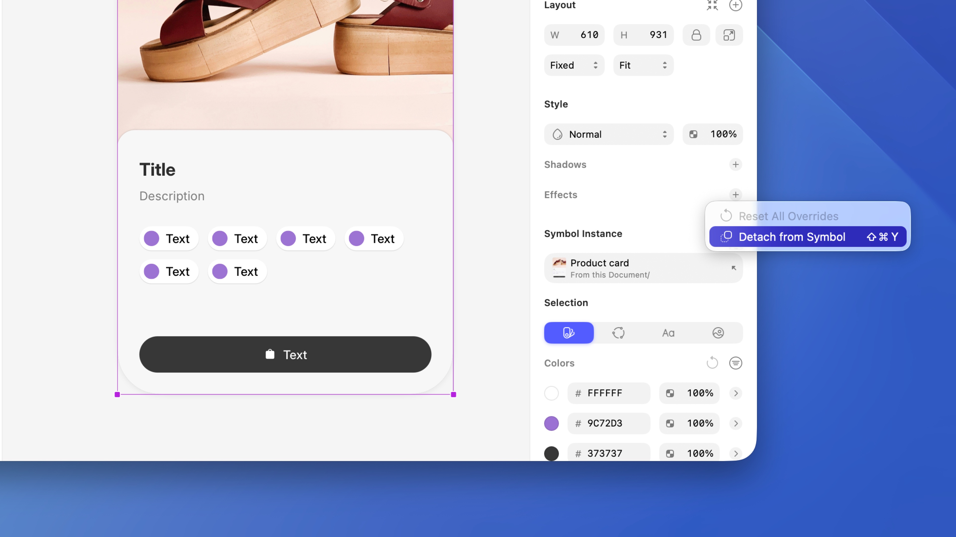
*Detaching converts the instance to a frame, leaving the source and other instances untouched.*
### Swapping components
You can swap components [using the popover](/docs/components-and-styles/replacing/) in the inspector. Choose a component from the list, or search for the component you’re looking for, and click to swap it with the selected component.
By default, swapping a component resizes the instance you’ve selected to fit its new component source. To keep the instance size the same when you swap components, turn off the “Preserve current dimensions when replacing” option in the Replace popover.
If the component has [variants](/docs/components-and-styles/variants/), you’ll find its properties directly below the swap popover in the inspector. Change a property’s value to swap the instance to a different variant of the same component.
### Scaling and resizing components
You can scale and resize components like any other layer using the Scale command. Choose **Layer** > **Transform** > **Scale** from the menu (or press K). Styles and properties like borders increase or decrease in proportion with the component instance, without affecting the source.
## Organizing components
### Creating component groups
To group components together in the assets view and [command bar](/docs/interface-and-settings/the-mac-app-interface/the-command-bar/), name them using the format: `Group-name/Component-name`. For example, two components named `Button/Normal` and `Button/Pressed` become part of a group named `Button`. You can also pick a group when you create a component.
> **Note:** You need two or more components in a group before they appear in their own submenu.
### Organizing components in the assets view
You can also organize your components in the [assets view](/docs/interface-and-settings/the-mac-app-interface/the-assets-view/) . To group several components together, hold ⌘ and select the ones you want to group. Control-click on any of them and choose **Group**. Give the new group a name by double-clicking on it in the left sidebar of the assets view.
To rename a single component, click on it and rename it using the inspector. To rename a group, double-click on the group name in the left sidebar.
You can also add a component to an existing group by dragging it to the left sidebar.
Components in the assets view are ordered alphabetically. You can also assign search keywords to any component to make it easier to find without knowing its exact name.
### Using the components page
Keeping component sources on a separate “Components” page helps keep things organized, especially in complex documents. It also makes it clear when you’re working with a component source rather than an instance.
To move component sources there, select them and choose **Layer** > **Component** > **Send to “Components” Page**. We look for a page named “Components” or “Symbols”, and create a “Components” page if your document has neither. You can also drag a component source onto the page’s title in the layer list.
When you paste instances of components that aren’t in your document yet, or unlink components from a library, Sketch also places their sources on the “Components” page, creating it if needed.
To send component sources to any other page or section, Control-click on them and choose **Send To**, or choose **Arrange** > **Send To** in the menu bar. Choose **New Page…** to create a new page for them. After you send layers, we confirm the move on the canvas with the option to go to the layers you moved.